BRAND IDENTITY
Way back in 1883, pharmacy students at the University of Michigan got together and founded a fraternity to support the school’s College of Pharmacy. Originally named Phi Chi, the organization – which was spreading across the country – voted in 1909 for a little change to its name, putting “Delta” in the middle.
Today’s Phi Delta Chi is one of country’s largest pharmacy fraternities, with over 60,000 initiated brothers and sisters. Its purpose? Helping pharmacy students and professional pharmacists grow in their careers and contribute to their communities.
A while back, the leadership of Phi Delta Chi hired Factory to give the brand a bit of a makeover. Our goal: Freshen the brand identity, create a contemporary new logo and help Phi Delta Chi continue evolving into an organization both pharmacy students and working pharmacists can grow with throughout their lives.
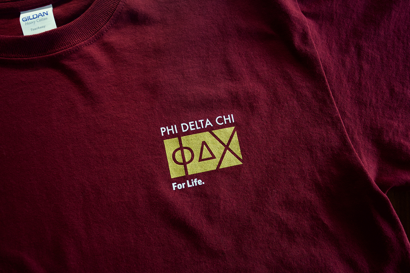
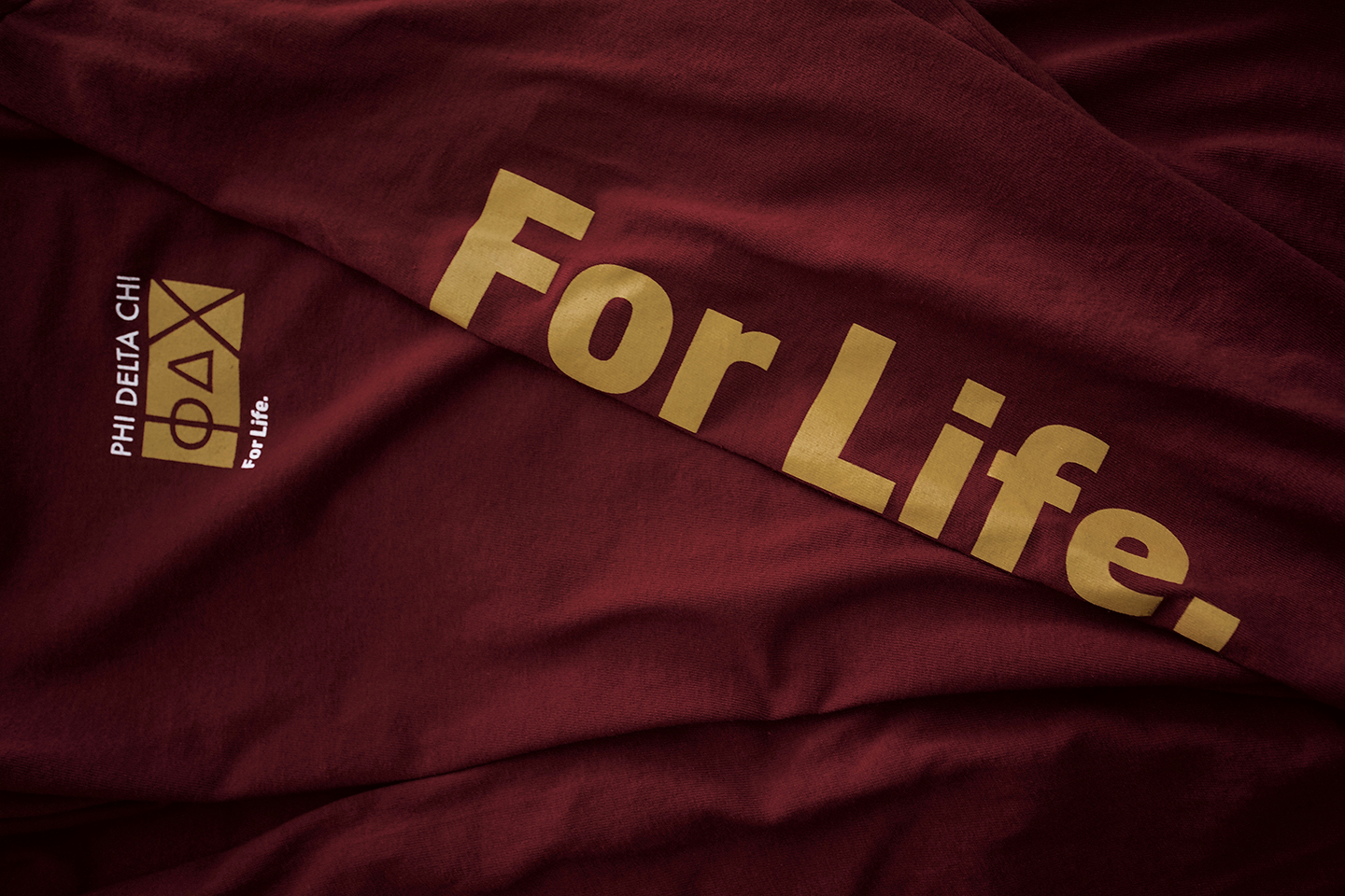
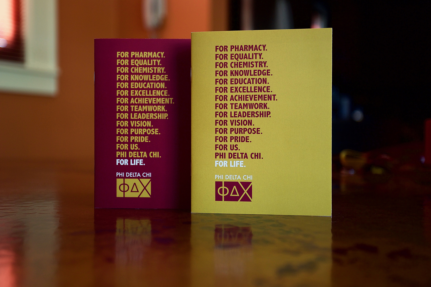
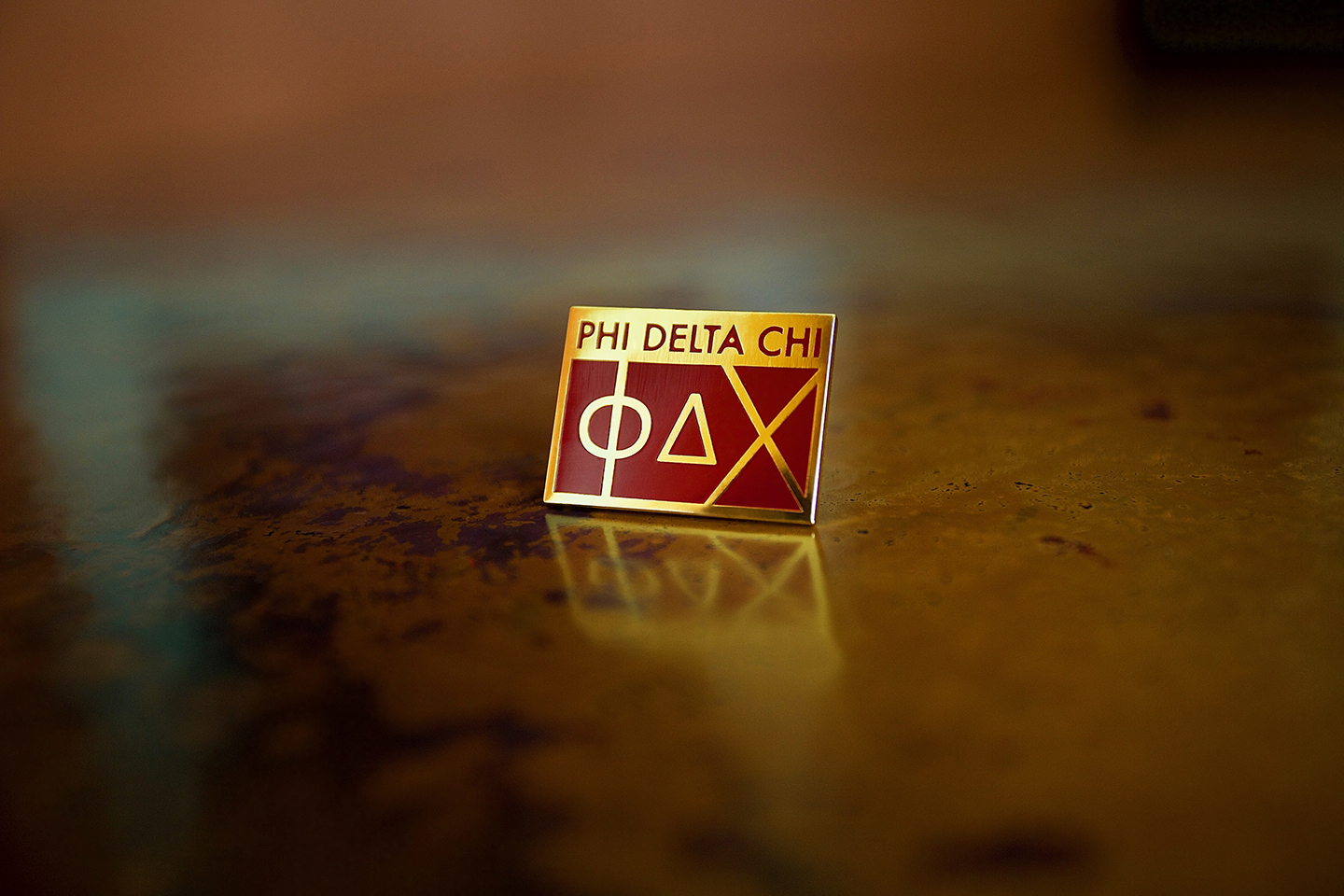
The centerpiece of the effort is the new Phi Delta Chi logo. Simple, clean and bold, the logo makes a fresh visual statement in a category – professional fraternities – long dominated by collegiate crests.
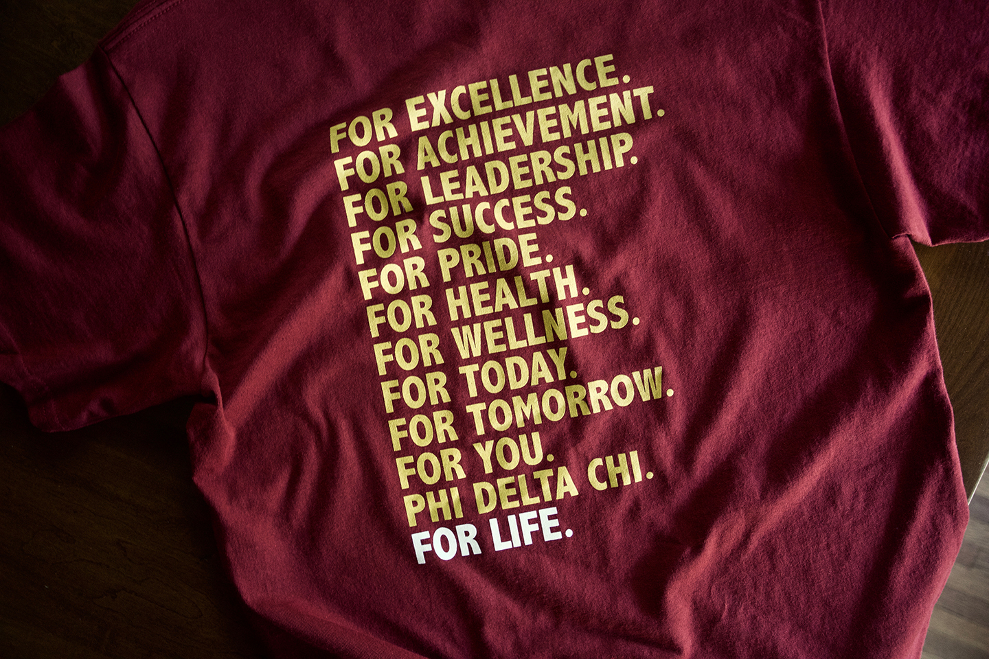
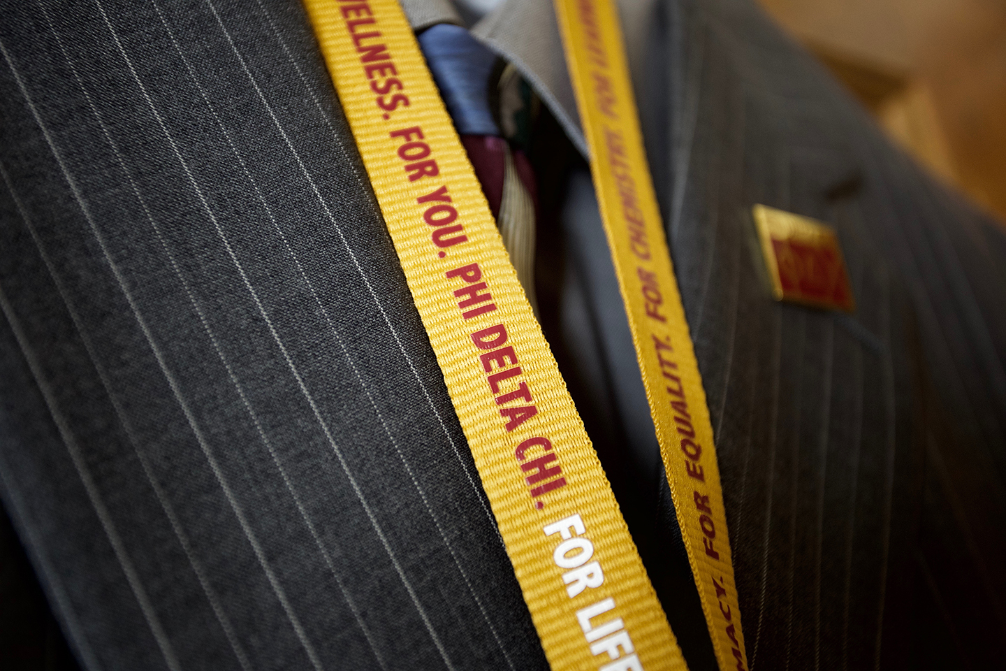
Complementing the new logo is a slight tweak to the organization’s motto. It was “Brothers For Life.” Now it’s just a simple “For Life” . . . recognizing both the lifelong relationship Phi Delta Chi offers its members as well as the important contributions pharmacists can play in the lifelong health and wellness of their patients and customers.