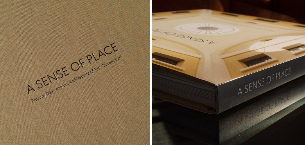
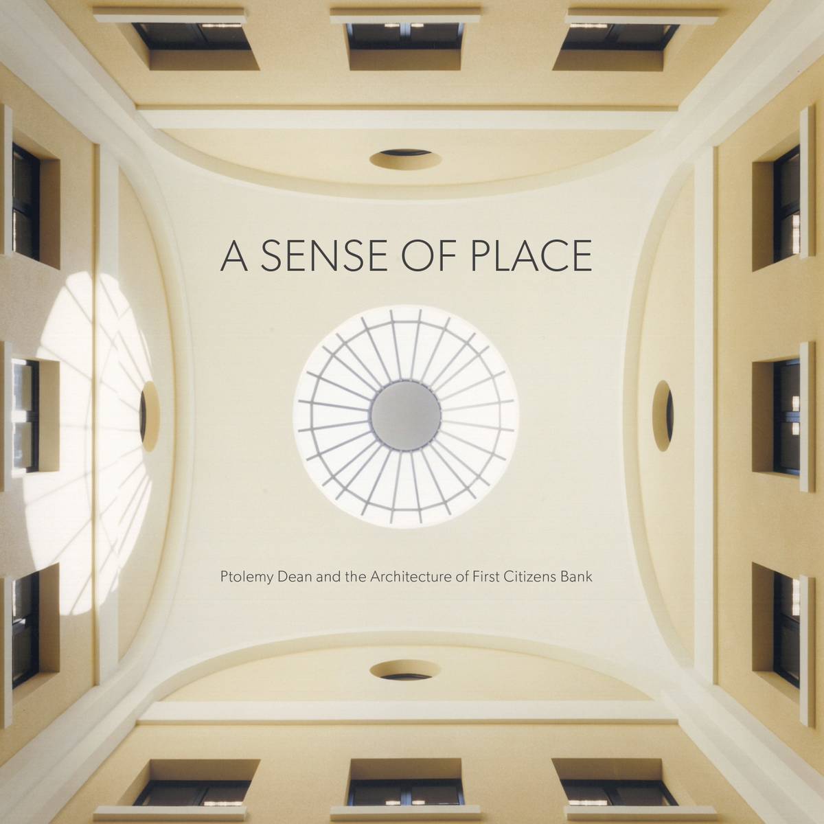
A SENSE OF PLACE
First Citizens Bank has long taken its architecture seriously. How the bank presents itself to customers, employees and the communities it serves matters. It’s important to feel solid, dependable, reliable, strong but also human and warm . . . all qualities the bank proves out every day.
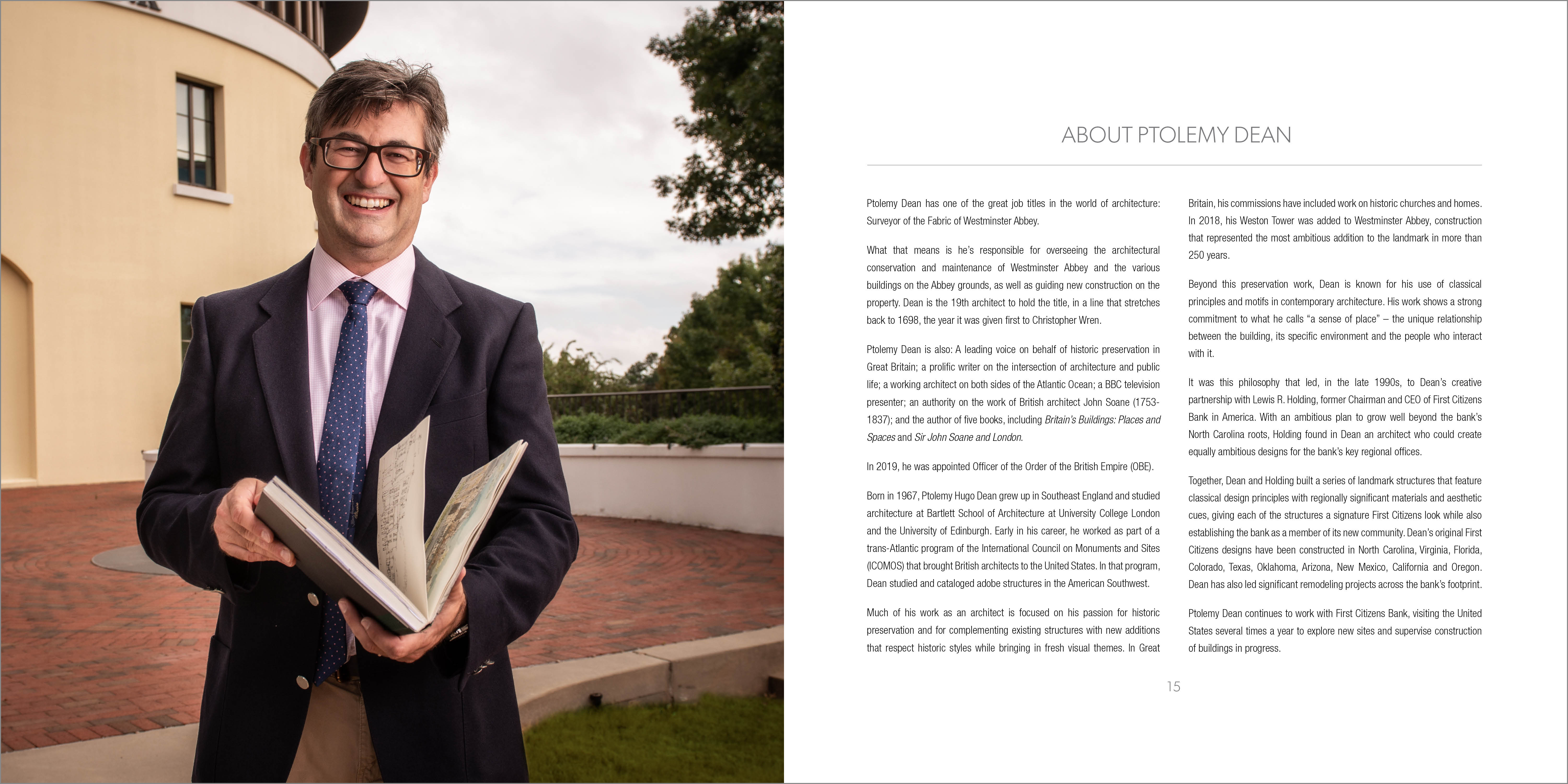
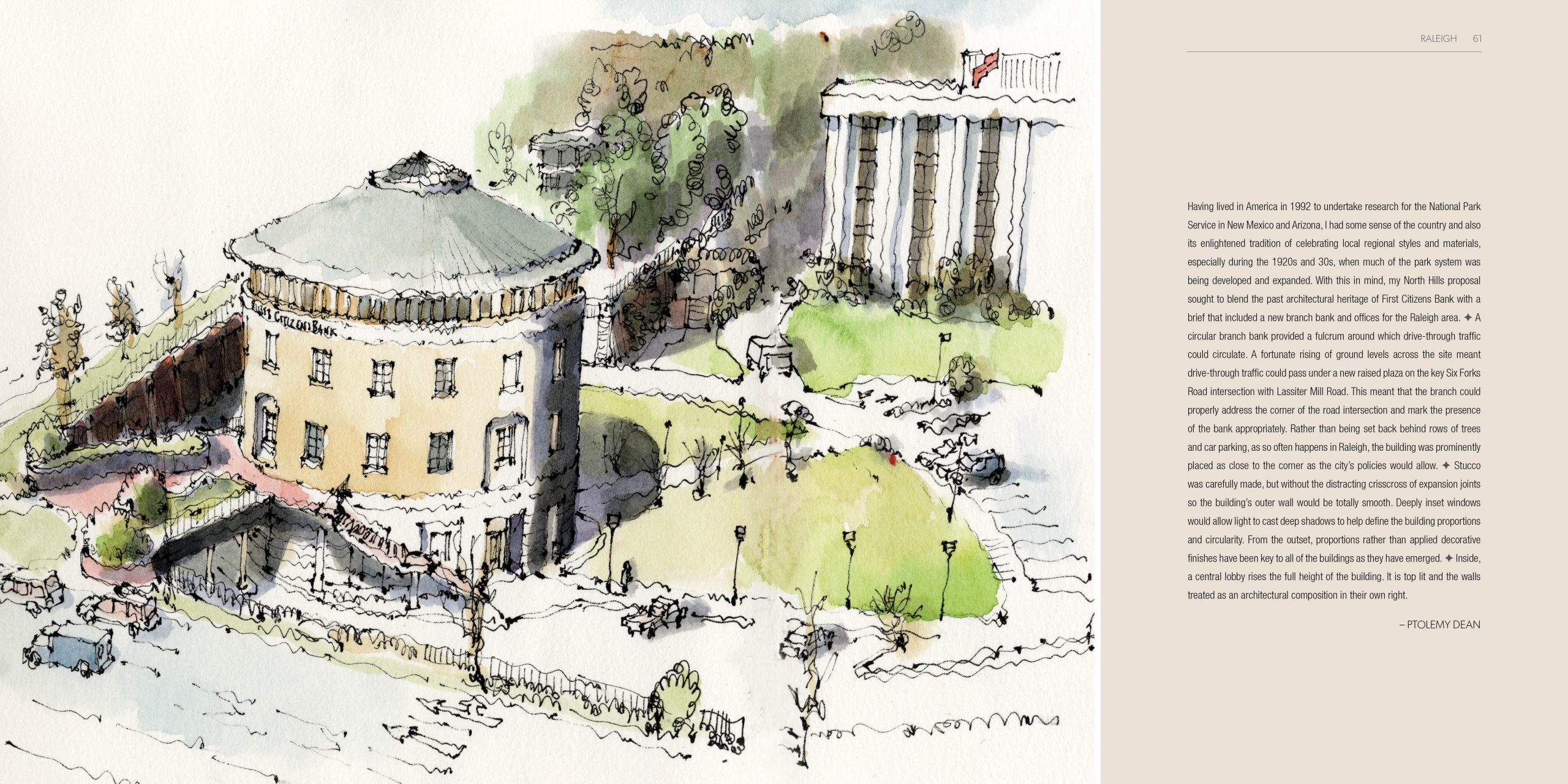
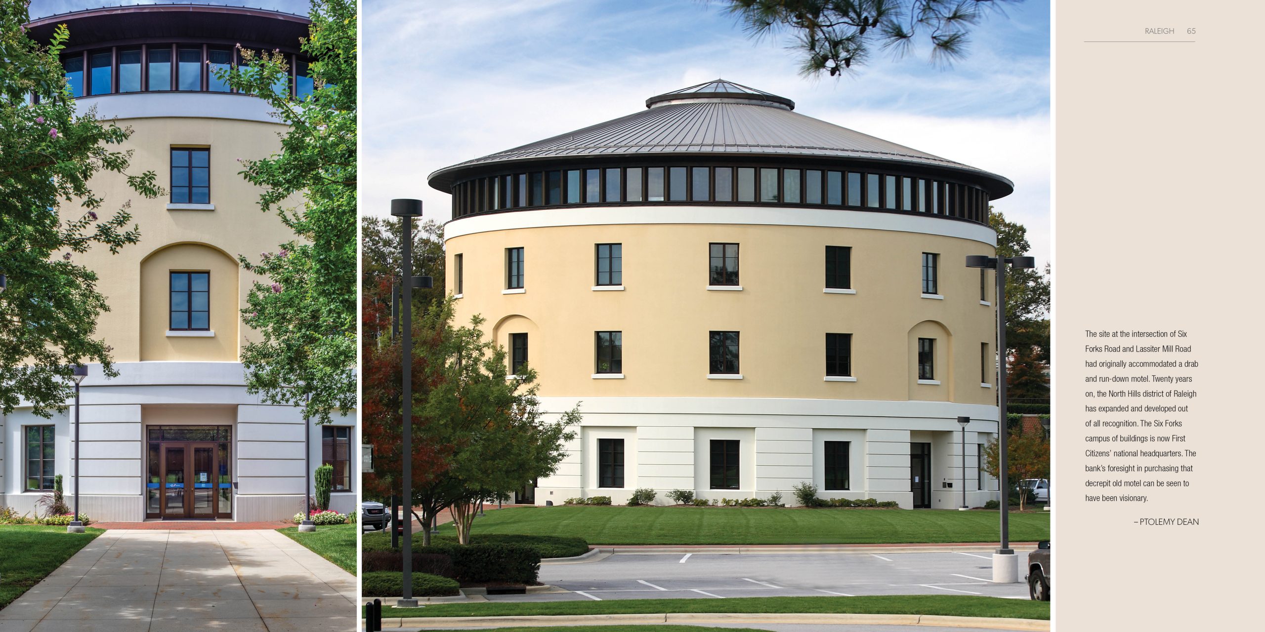
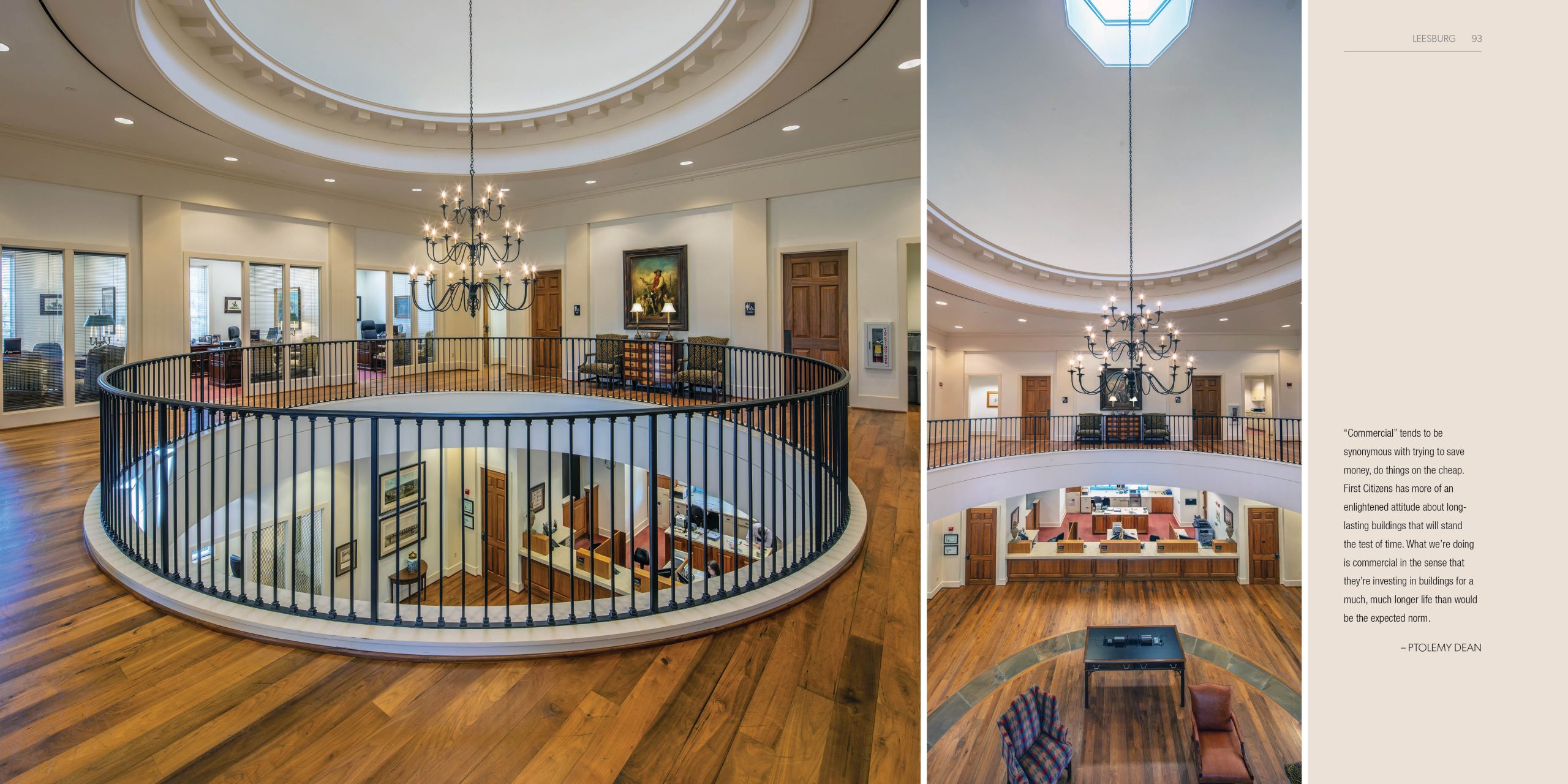
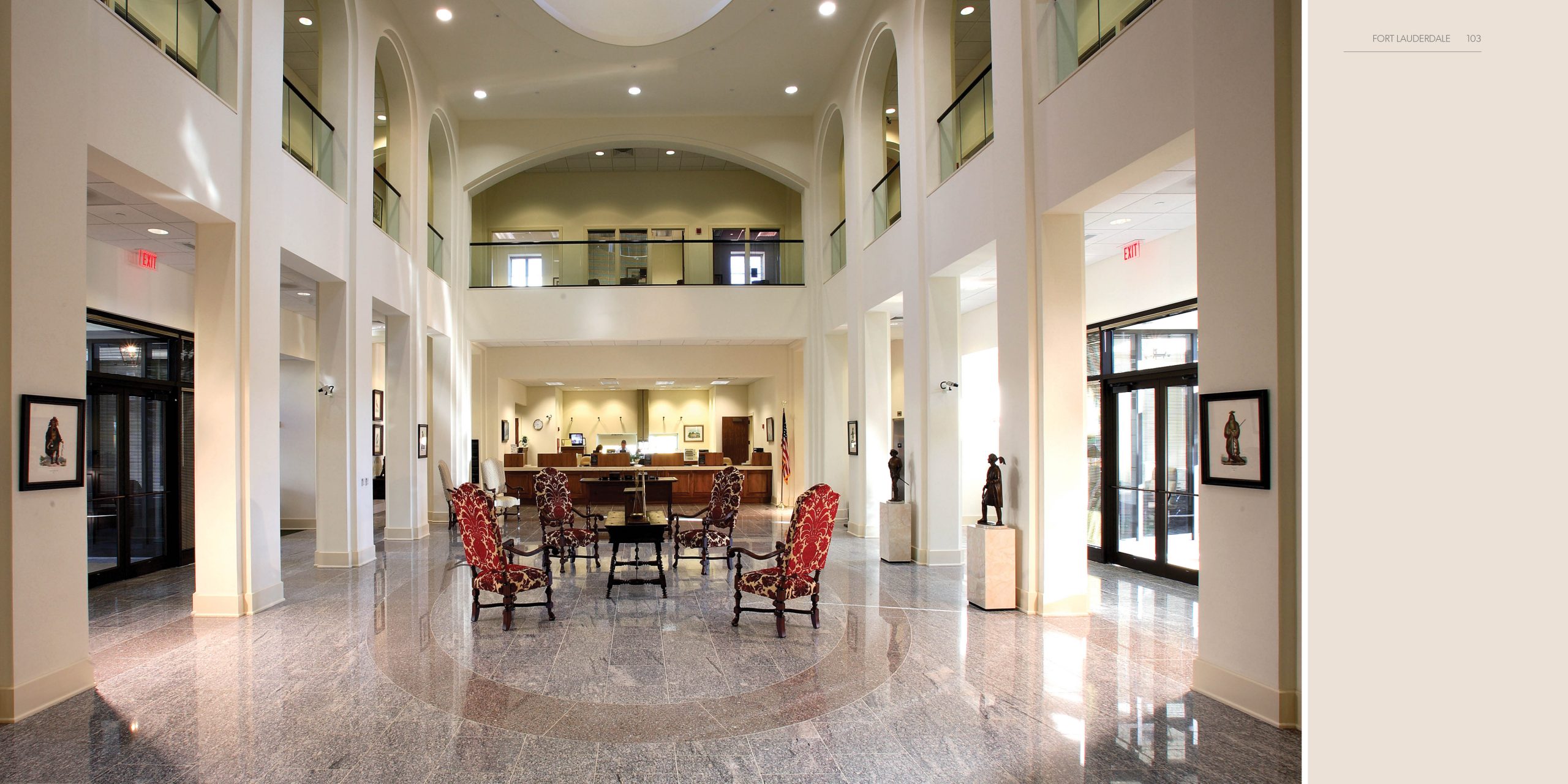
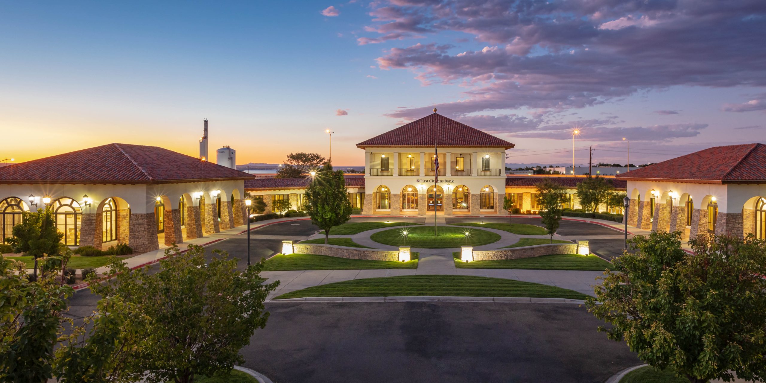
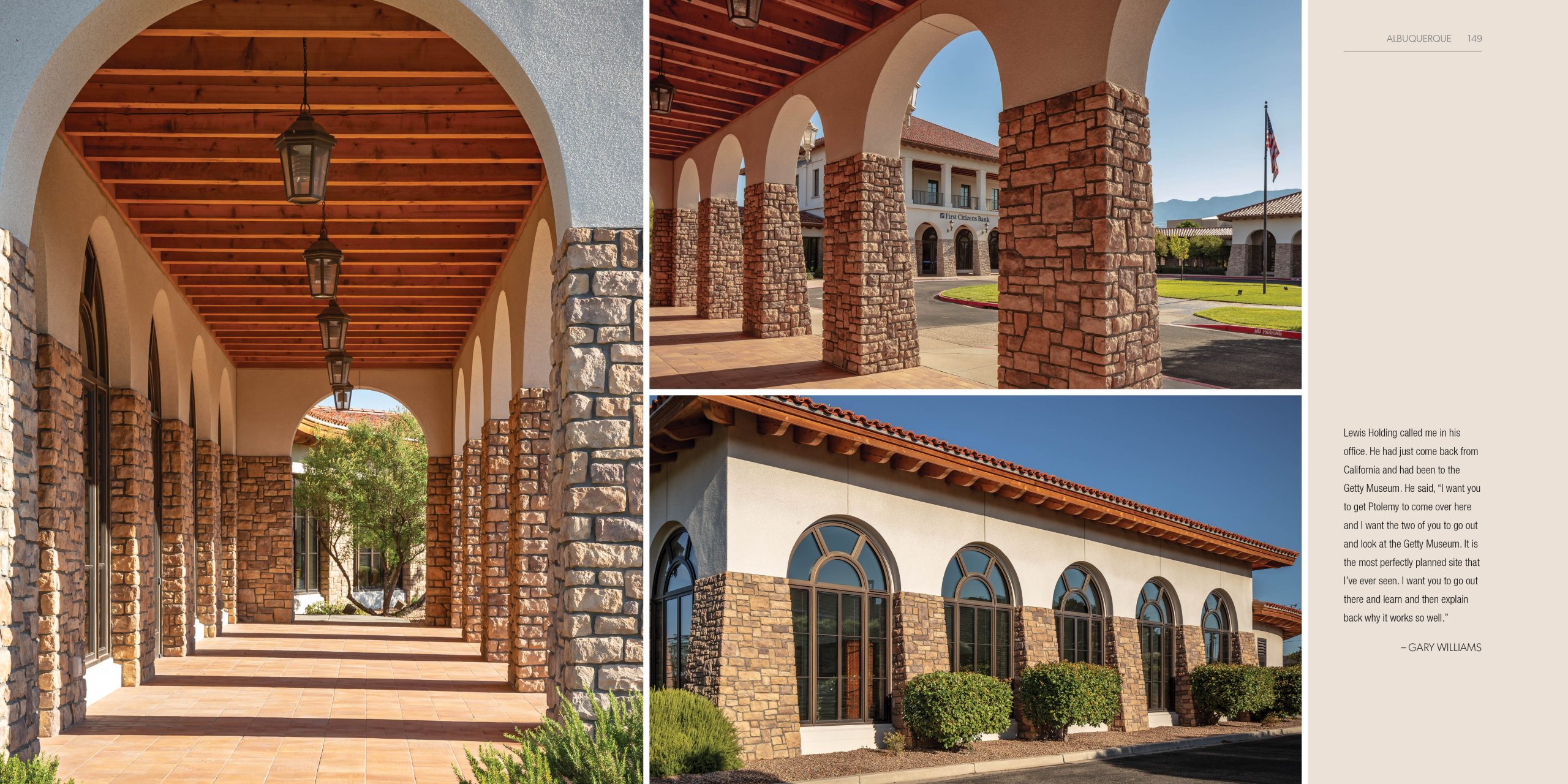
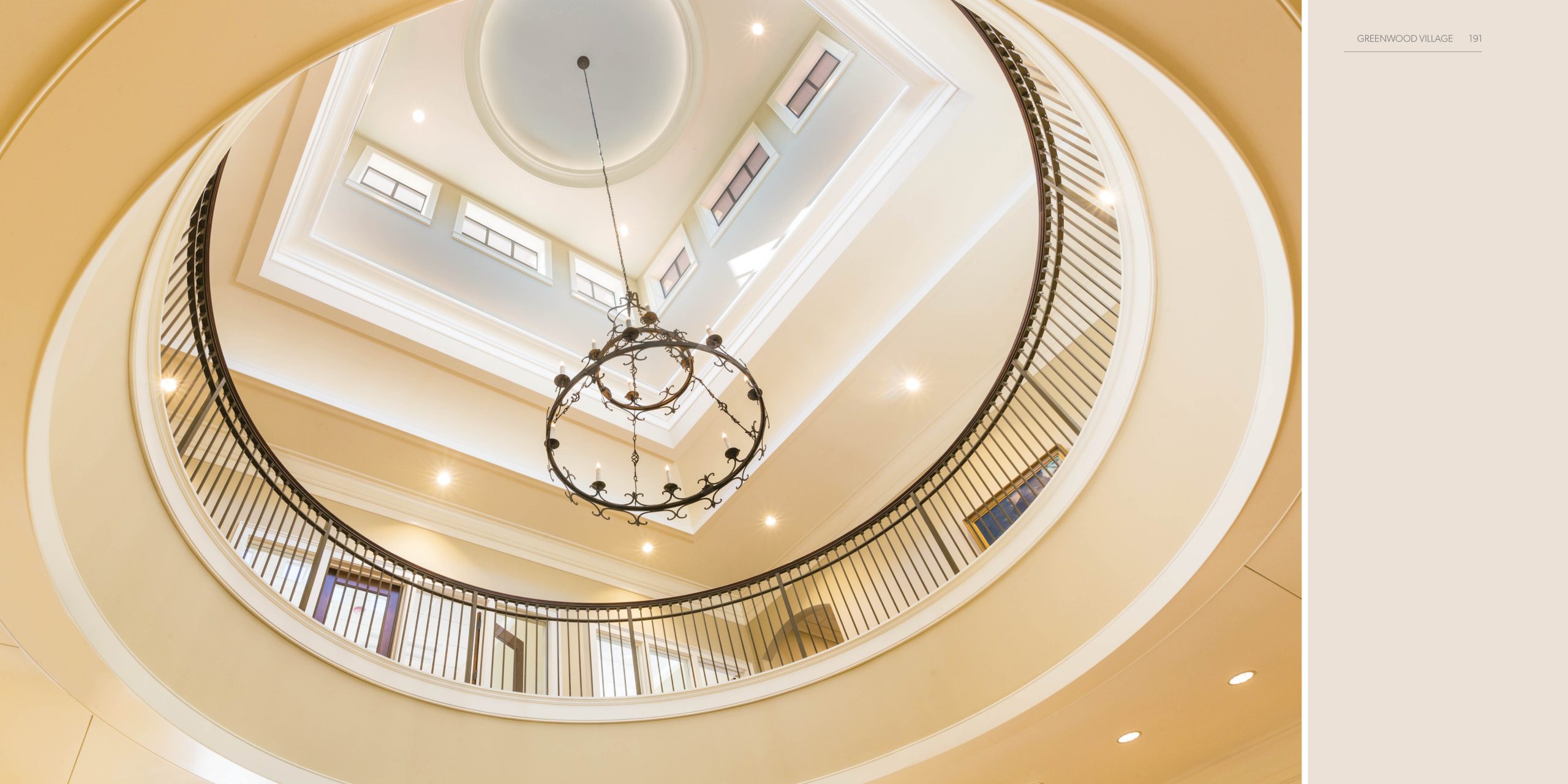
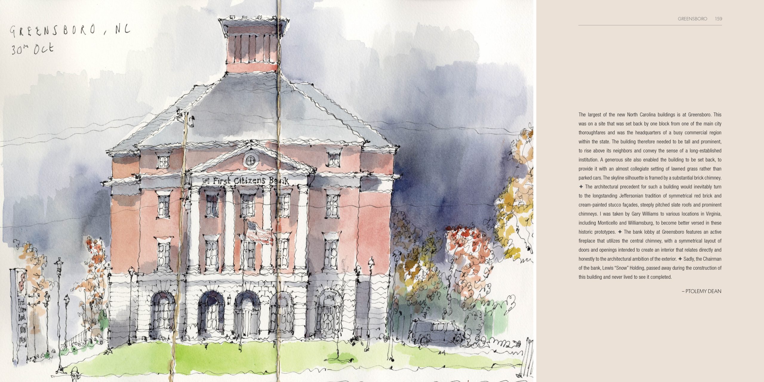
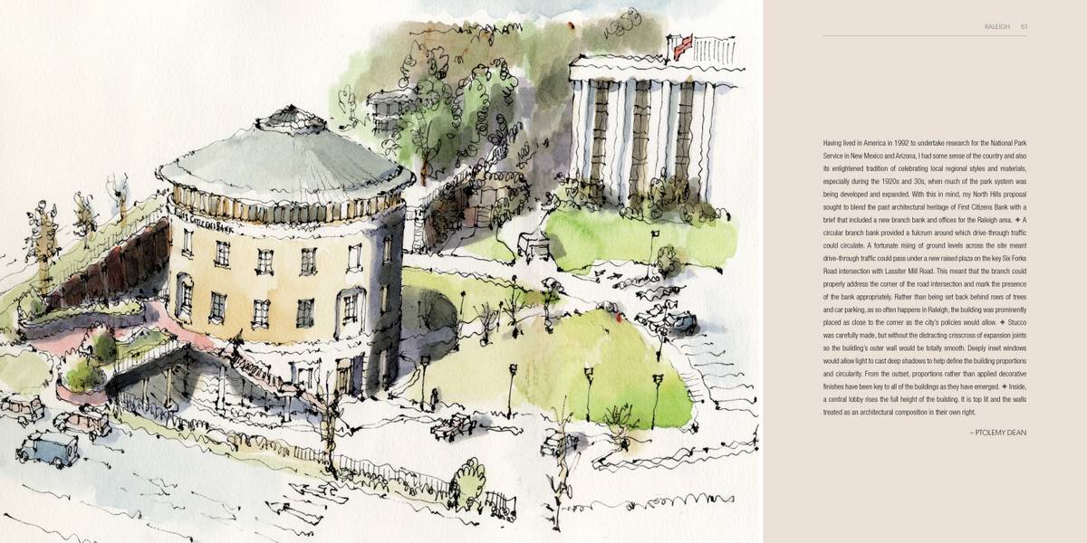
In the late 1990s, First Citizens began working with an acclaimed British architect by the name of Ptolemy Dean to design one-of-a-kind regional offices. Not just branches – though they are branches and you can do all your banking inside – but larger facilities where you’ll also find business bankers, commercial bankers, wealth advisory teams and regional executive leadership . . . and, frequently, community events bringing together local business organizations and nonprofits.
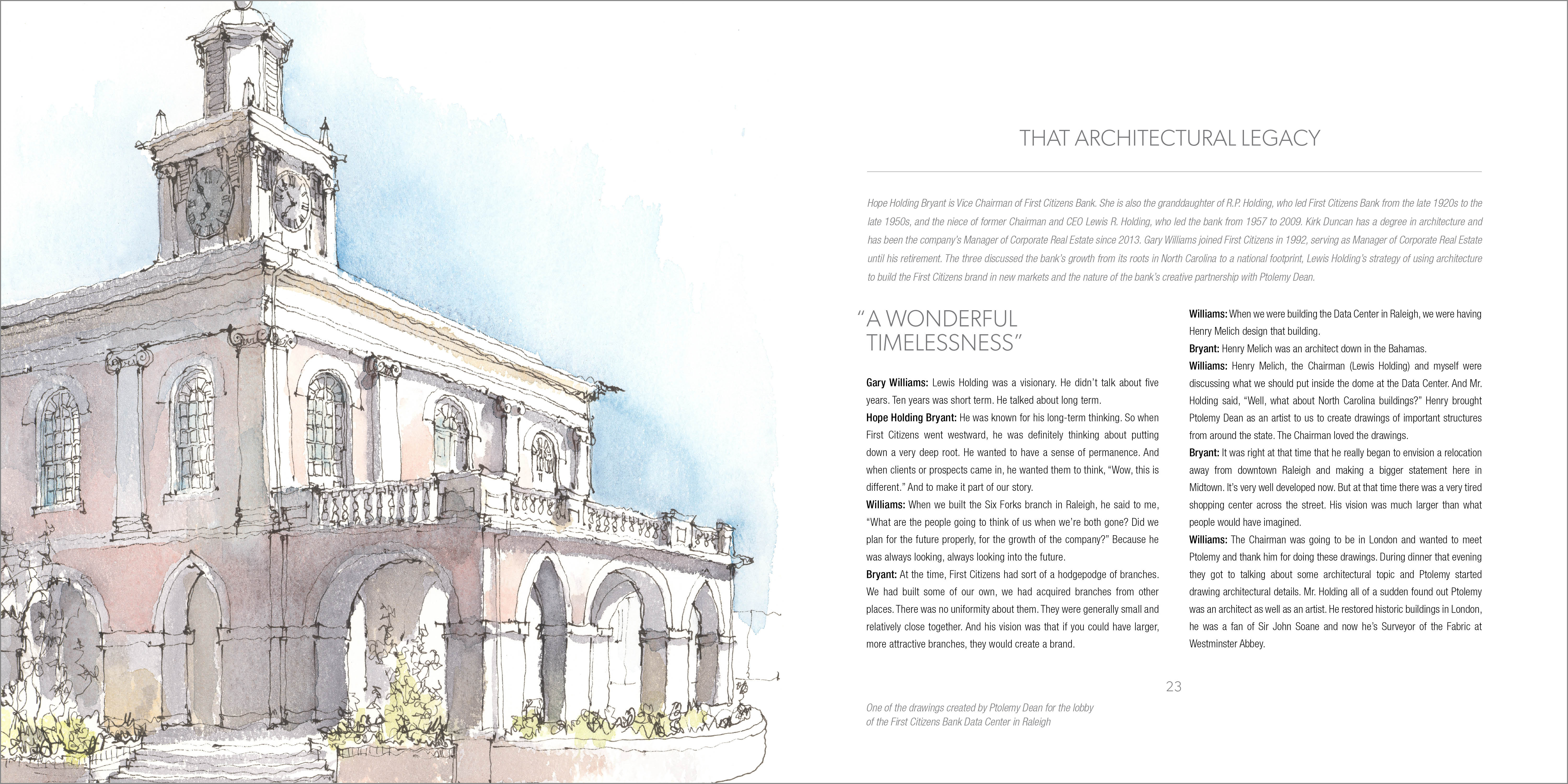
Each office would reflect the aesthetic traditions of the region it served – embracing local design cues, ornamentation and building materials – as well as the brand’s lasting commitment to classical principles of design. The result . . . creating buildings that looked like part of the local community while at the same time bringing First Citizens’ values to new regions.
These bespoke offices would go up in places like: Raleigh, North Carolina; Denver Colorado; Leesburg, Virginia; Ft. Lauderdale, Florida; Portland, Oregon; La Jolla, California; Albuquerque, New Mexico. And more. It’s an impressive collection.
As First Citizens approached the 20th anniversary of the first of those buildings, our clients asked us to create a book that would commemorate the collection and the relationship between the bank and the architect.
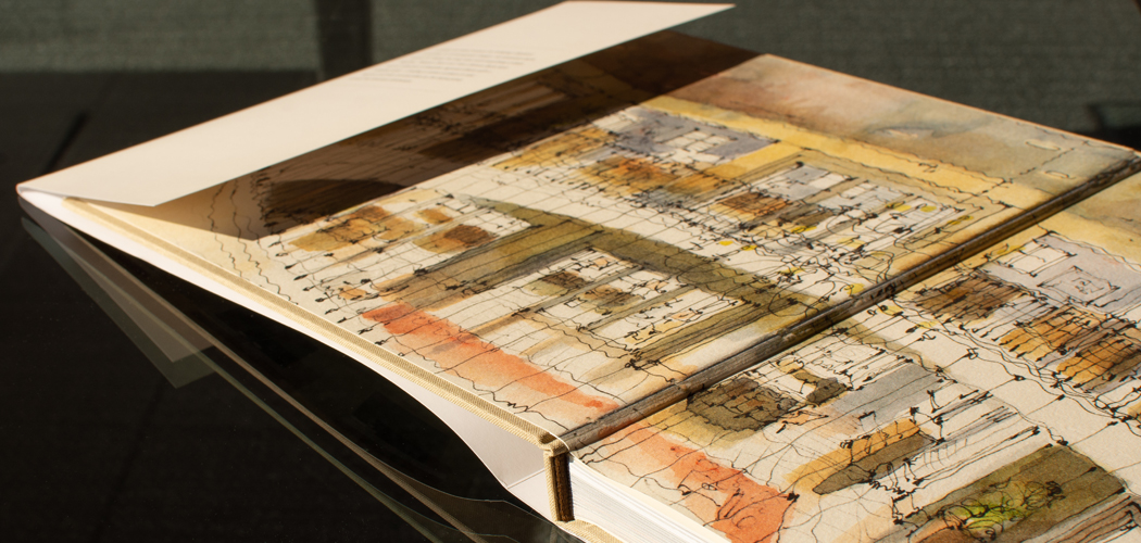
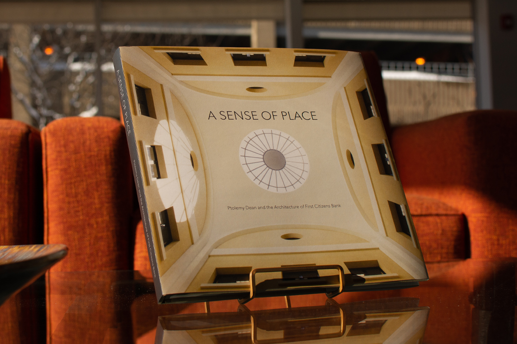
So we did. It’s an impressive, lavishly illustrated and beautifully constructed coffee table book called A Sense Of Place. If we say so ourselves.
Lead work on this project at Factory was done by Director of Design Izabela Skonieczka, our Production Manager Jason Barthlow and former Factory designer Kelsey Kaptur (who has since moved to warmer and sunnier climes).

To print this labor of love, we worked with Classic Color in suburban Chicago. They do a lot of different kinds of printing, but truly excel at bringing to life fine art books, which this surely turned out to be (again, if we say so ourselves).
To learn more about this project, read Mark Lantz’s blog post on it, here.