. . . is something you hear a lot about in the ad business. It can mean different things. The way a narrative unfolds in a TV commercial. The way language, tone and voice are used in a radio campaign. The way headlines are phrased in a billboard campaign. The way social media – or public relations or event marketing or whatever – is used to give people deeper understanding of the history, behavior, qualities and values that make a brand what it is.
Considered broadly, storytelling can mean just about anything and everything a brand does to shape the way we experience it and perceive it. Packaging. Logowear. Websites. Brochures. Email. Business cards.
Architecture? That, too.
Fast food brands have long used signature architecture to make memorable impressions and/or create an ambience people (some people or other, depending on which brand and which people) will find inviting or reassuring. Think Pizza Hut’s red roof and Micky D’s Golden Arches, to name just two.
What about other industries?
If I recall correctly, Embassy Suites built its properties – and its brand – around atriums (or atria for those who speak Latin), creating a more premium feel for a mid-range hotel chain and framing a gathering space for its guests.
Apple uses clean, minimalist design in its stores with big splashes of photography and video to create a staging environment for its products . . . and, one might say, its overall brand philosophy.
Whole Foods stores typically look like what you’d want a Whole Foods to look like. Light, airy, lots of wood, crunchy.
ALDI on the other hand strips things down to the basics so customers don’t suspect there’s extra cost for space, hardware and décor hidden in the price of ALDI’s private label goods.
What about a bank? What can architecture say about a bank brand? Can it add to that storytelling?
Now, if you’re reading this, there’s a good chance you know our ad agency, Factory, works with a bank called First Citizens.
First Citizens is headquartered in Raleigh. They started out about 120 years ago as the one-branch Bank of Smithfield (that’s Smithfield, North Carolina, where Ava Gardner came from, not Smithfield, Virginia, where the ham comes from). They’ve got north of 500 branches in something like 18 states. They do retail banking, business banking, commercial banking, wealth management, the full schmear.
(Full disclosure, not only am I a vendor to First Citizens, I am also a client.)
And this is the most important part: First Citizens has been led for most of the past hundred years by members of the same family.
It started with a gentleman by the name of Robert Powell (R.P.) Holding. Who, interestingly, came to the bank as a 22 year old law school graduate too young to practice in North Carolina, so he took a job as a clerk at the local bank. He climbed his way up the ladder, then his kids came to work at First Citizens, then their kids and so on.
That family leadership has created in First Citizens a specific approach to banking that’s not like most other banks, at least not the ones I’ve banked at. If you had to sum up what defines First Citizens, you’d use words and phrases like strong and stable and long-term and vision and relationships and respect and service and community. First Citizens isn’t about chasing fads and scoring a quick financial hit, it’s about building something that lasts, generation after generation.
Which I insanely love about the brand. From the beginning First Citizens felt very familiar, like other clients of other agencies I’d worked at, way back in my formative years.
For instance, the first agency I worked at was Wyse Advertising in Cleveland. Wyse had a defining account for something like 30 years. The J.M. Smucker Company. Led by the family that founded it. Focused on quality. Guided by a vision and values passed down through the generations. Like I said, familiar.
When the two started together, Wyse was a handful of people and Smucker’s was a three-share regional brand in the jams and jellies category (or so I was told by someone who was in the position to know). Great product, a lot of hard work from the agency and one of the all-time classic ad slogans – “With A Name Like Smucker’s, It Has To Be Good” – built one of the strongest packaged goods franchises in this country.
My second agency was Rubin Postaer in Los Angeles. Their foundational account was (and is) Honda. The car side of Honda (not the motorcycles, the lawn mowers, the engines or what have you). Strong values. Quality products. Respect for customers and workers. Guided by the lasting vision of founder Soichiro Honda. Again, familiar.
I worked on the Honda business for a year, out of the Chicago office, doing messaging strategy for the “Heartland” region (draw a radius of about 300 miles around Chicago). It was a brand I was really proud to work on. This was back when Detroit was still mostly putting out crap and didn’t really care what the car-buying public thought. Honda had a respect and decency at the heart of its brand that radiated out of the product and informed the advertising. And that respect was most definitely returned by the people who chose the brand.
To me, First Citizens is like Honda and Smucker’s (and other brands with similar stories and sensibilities). A bank that does right by its customers (the wonderful stories I could tell you, but won’t) and puts positive energy into the world. I’m really proud to work on this brand. In 2013, we launched a whole new campaign for First Citizens around a two-word tagline: “Forever First.” The notion being the things that make First Citizens special are here to stay. Which can be reassuring to a lot of people. It’s been at the heart of our work for First Citizens ever since.
What does this have to do with architecture?
Well, think about “reassuring.” And about those qualities mentioned above, the strength and stability and respect.
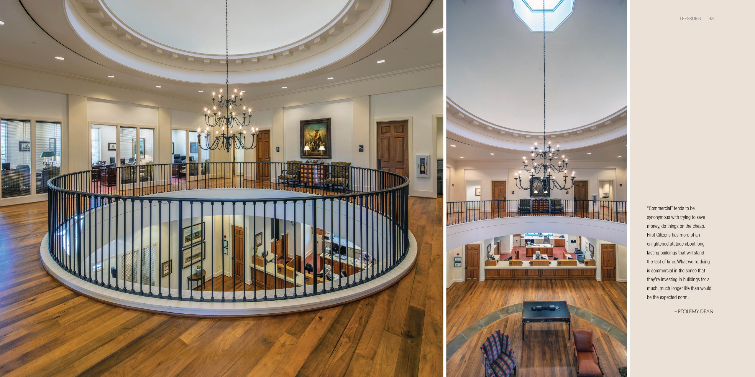
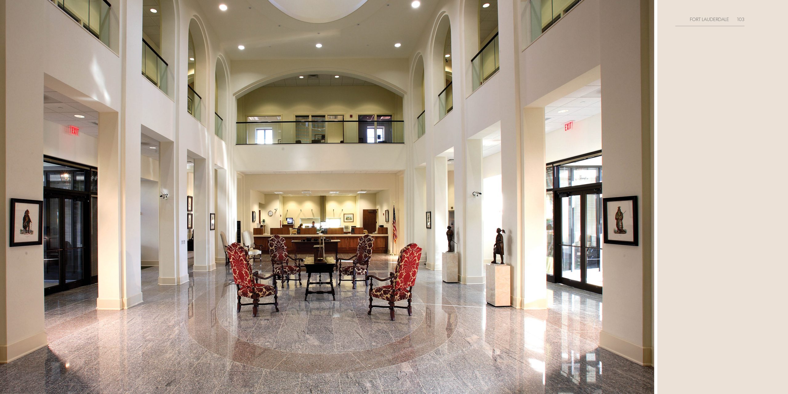
For a long time, First Citizens’ typical branches in most of its markets have had a classical architectural style. Reinforcing that feeling of reassurance, dependability, reliability, strength, permanence. They’re a little formal, but also warm and welcoming, like the people who work in them.
Around 20 years ago, give or take, First Citizens decided to up its architecture game.
In the markets where it does business, First Citizens usually sets up a regional mini-headquarters, a larger office more bankers (like business bankers and wealth advisors) and the regional leadership work out of. A lot of business is done in these spaces. And they often become gathering places for the local business community. Which makes them important outposts of the First Citizens brand. So, the thinking went, what if we made these regional offices architecturally significant?
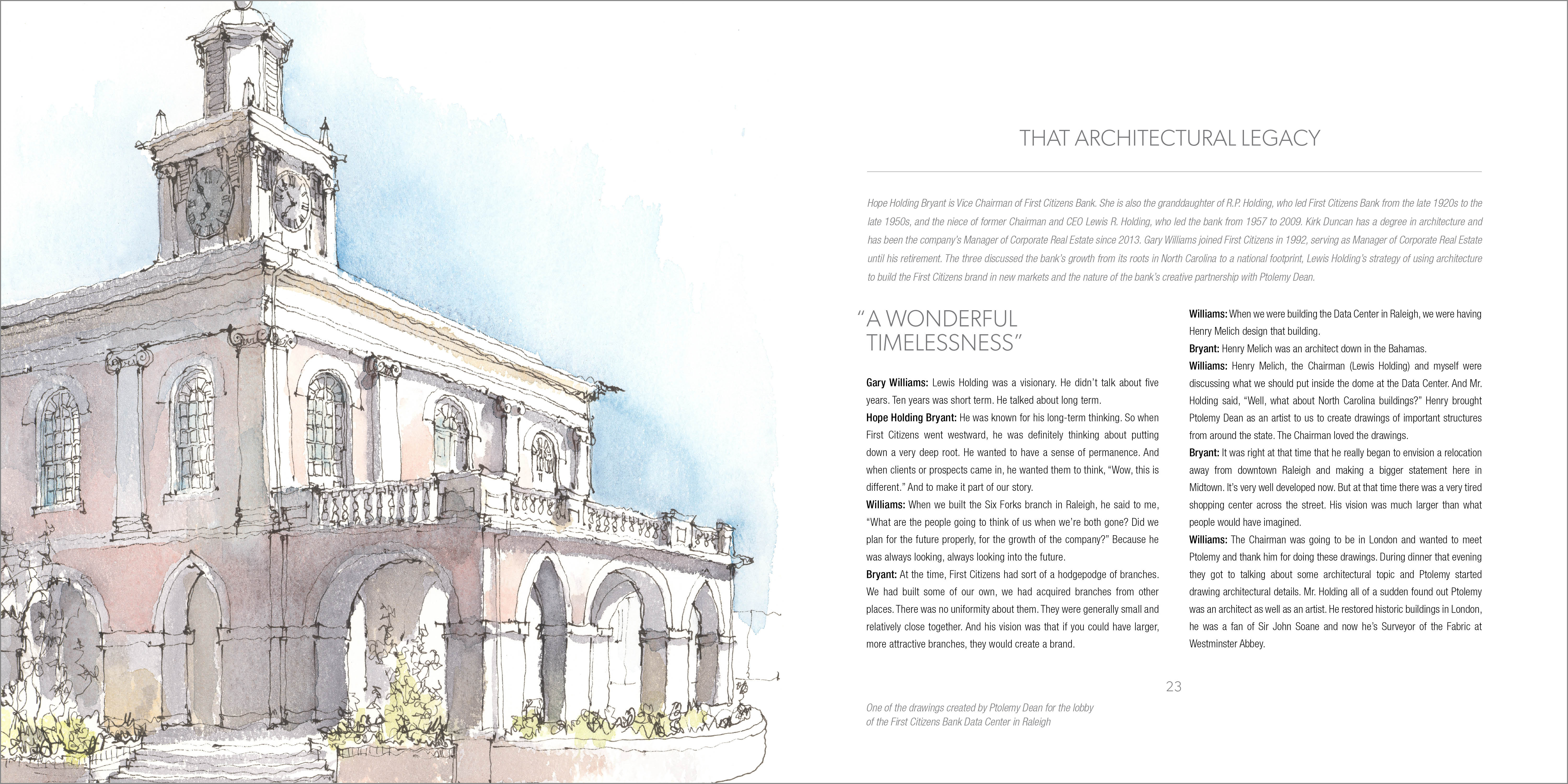
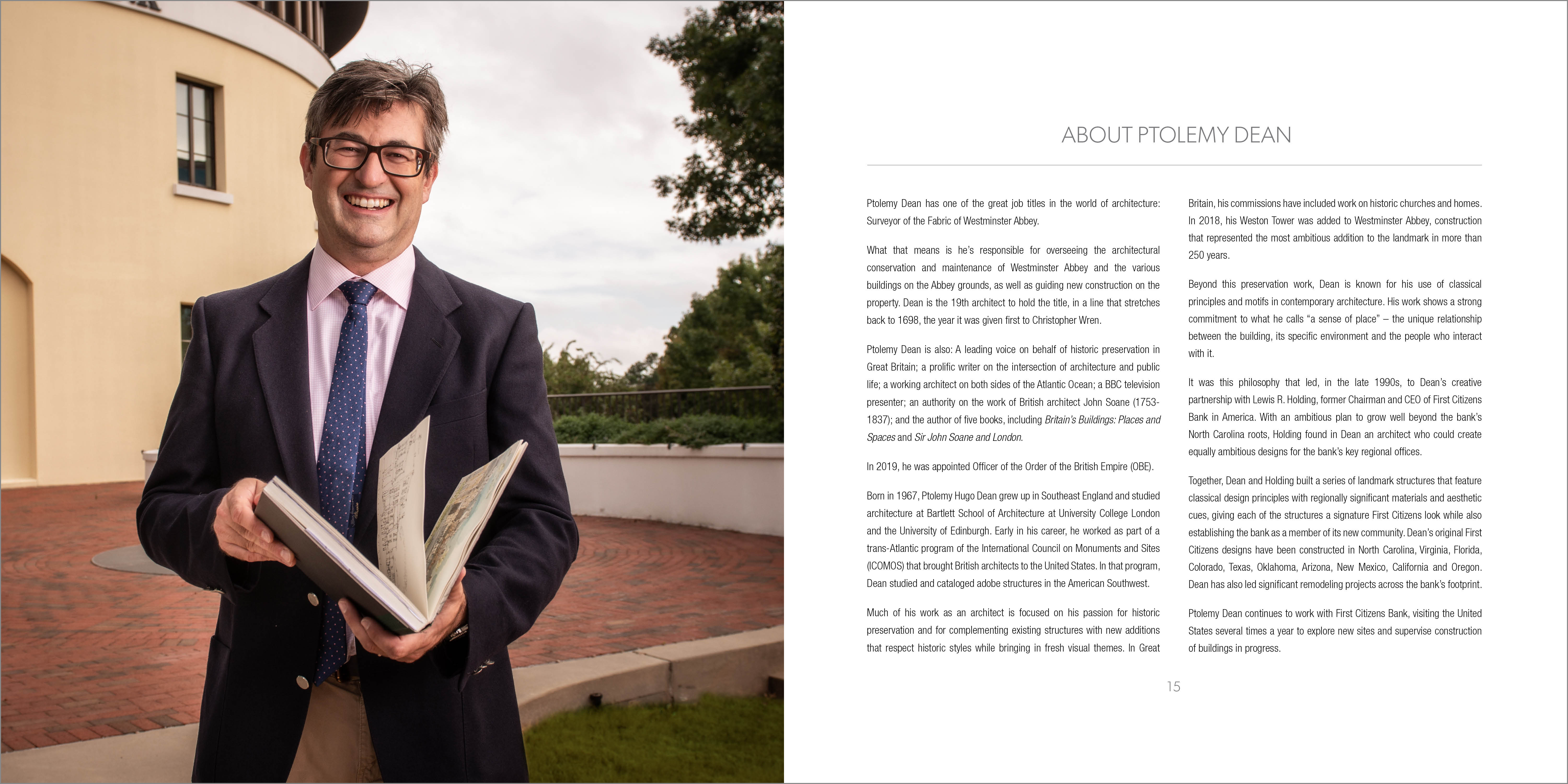
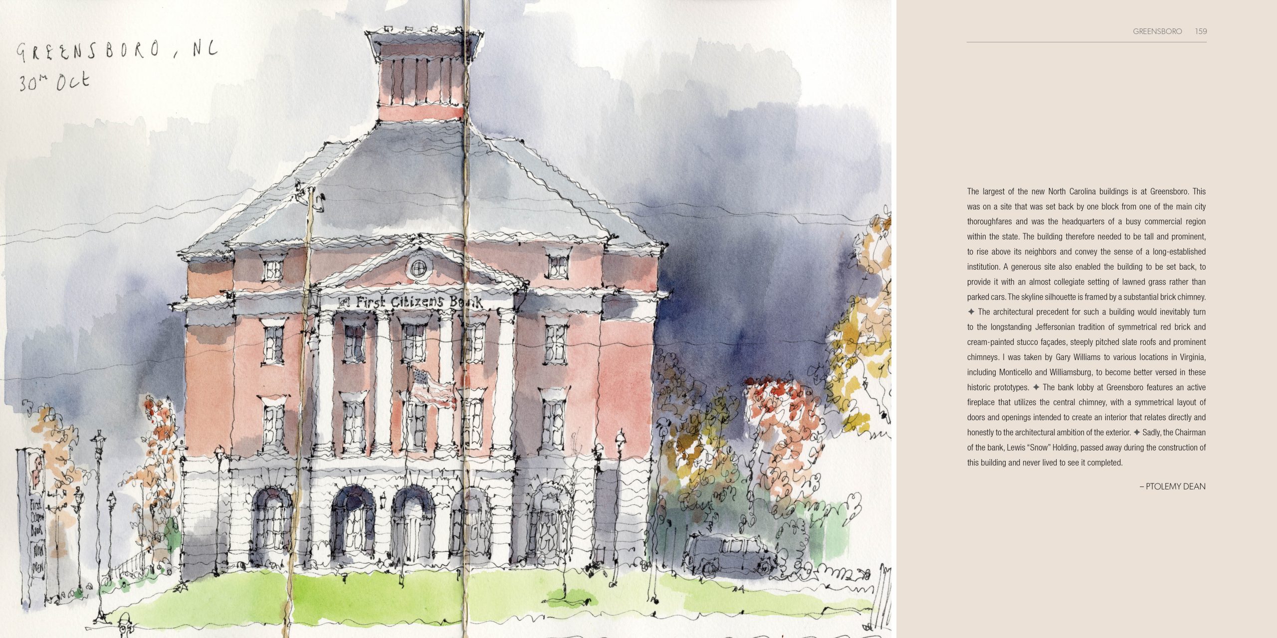
And that’s where a gentleman by the name of Ptolemy Dean comes into the story.
Who’s Ptolemy Dean? If you’re an architecture fan in Great Britain, you’ve heard of him. He’s a working architect. He’s hosted several television series about architecture. He’s published books on the British Neo-Classical architect John Soane (1753 – 1837), who designed the historic Bank of England building. He writes frequently in newspapers and magazines on the topic of historic preservation.
And he’s the 19th Surveyor of the Fabric of Westminster Abbey. Which means he’s the guy responsible for the decisions about how Westminster Abbey is preserved and, occasionally, updated (as with the Weston Tower he designed for the Abbey a few years ago). There have been 18 folks with that title before him, the first being the great Christopher Wren, who pretty much is responsible for what most people think of as the way historic London looks and feels.
Fun fact: Wren is buried in St. Paul’s Cathedral, which he designed. His epitaph reads “Lector, Si Monumentum Requiris, Circumspice.” Which translates (again with the Latin) to “Reader, If You Seek A Monument, Look Around.” Here in Michigan, the state motto is a blatant ripoff of that epitaph, but much dopier: “Si Quaeris Peninsulam Amoenam Circumspice.” Which translates to, “If You Seek A Pleasant Peninsula, Look About You.”
Like I said, dopier.
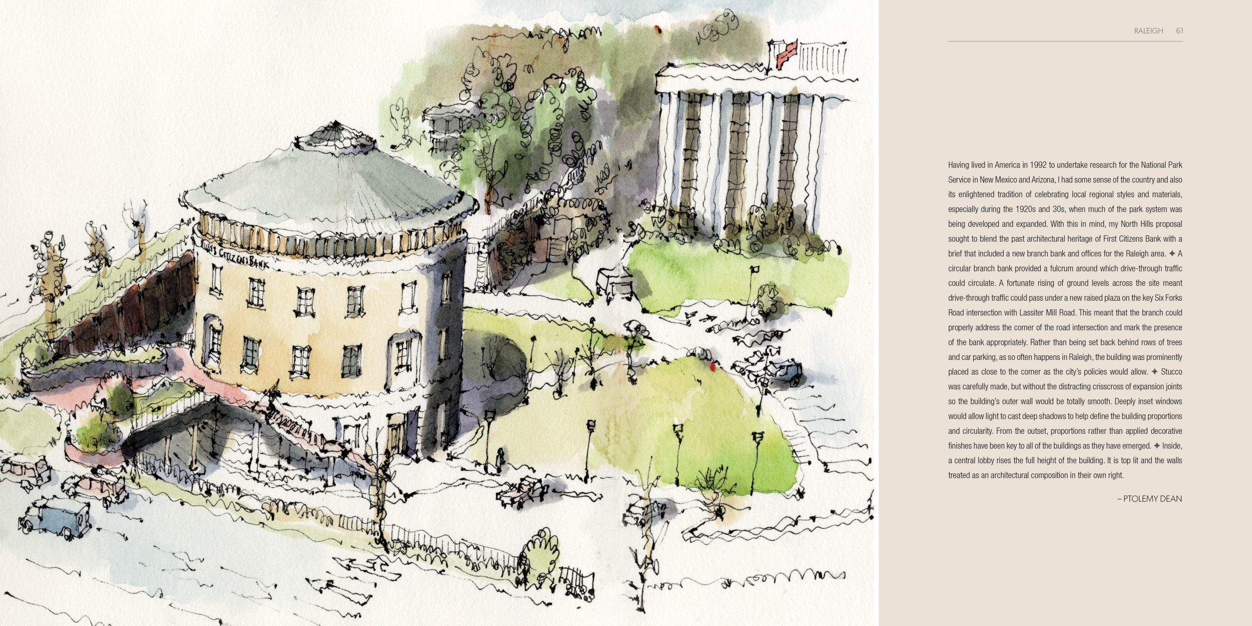
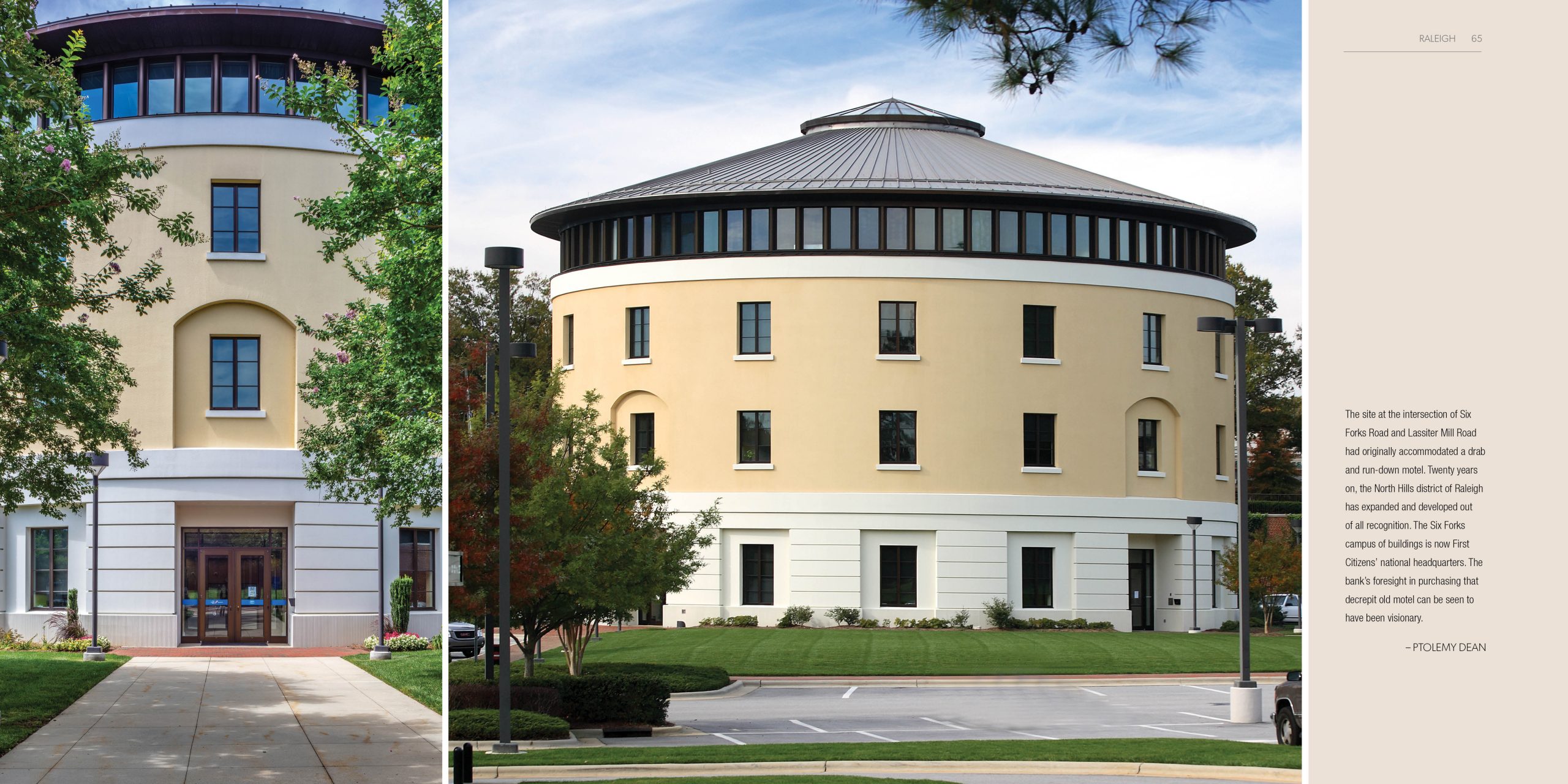
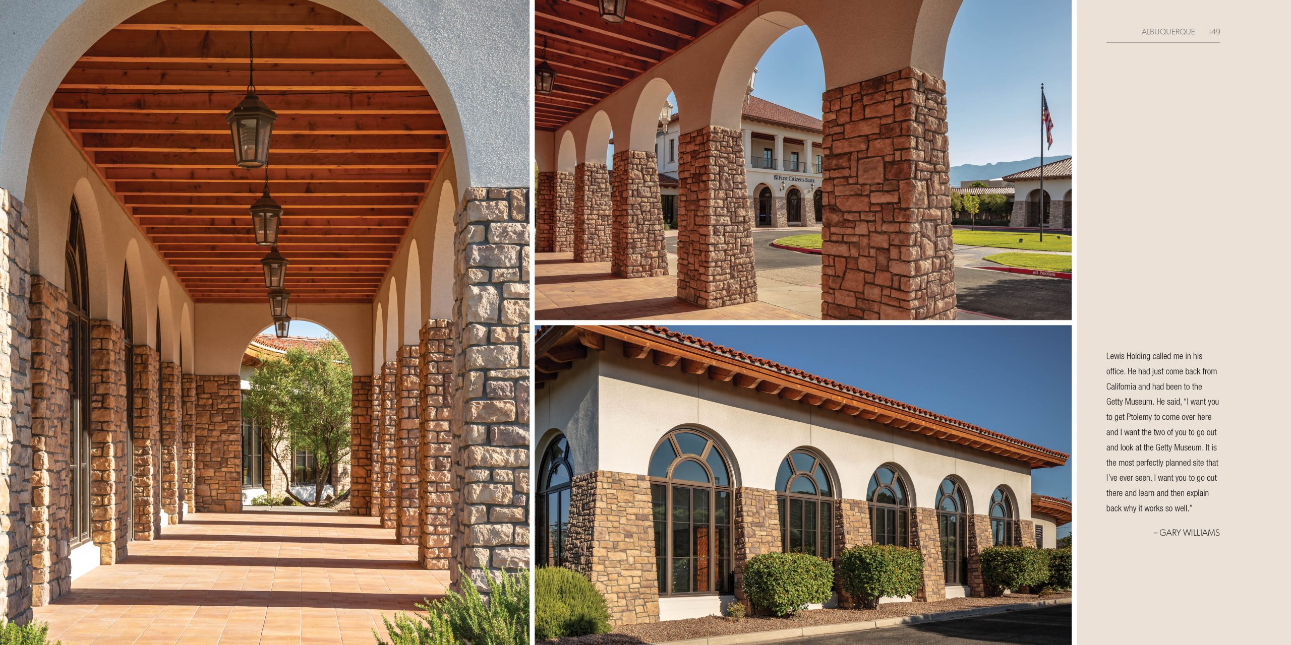
Anyway, the bank’s Chairman and CEO at the time, Lewis Holding, who was an enthusiast for architecture, design and history and a collector of art and antiques, invited Ptolemy Dean to begin working with First Citizens on those regional offices, starting with the bank’s flagship branch on Six Forks Road in Raleigh.
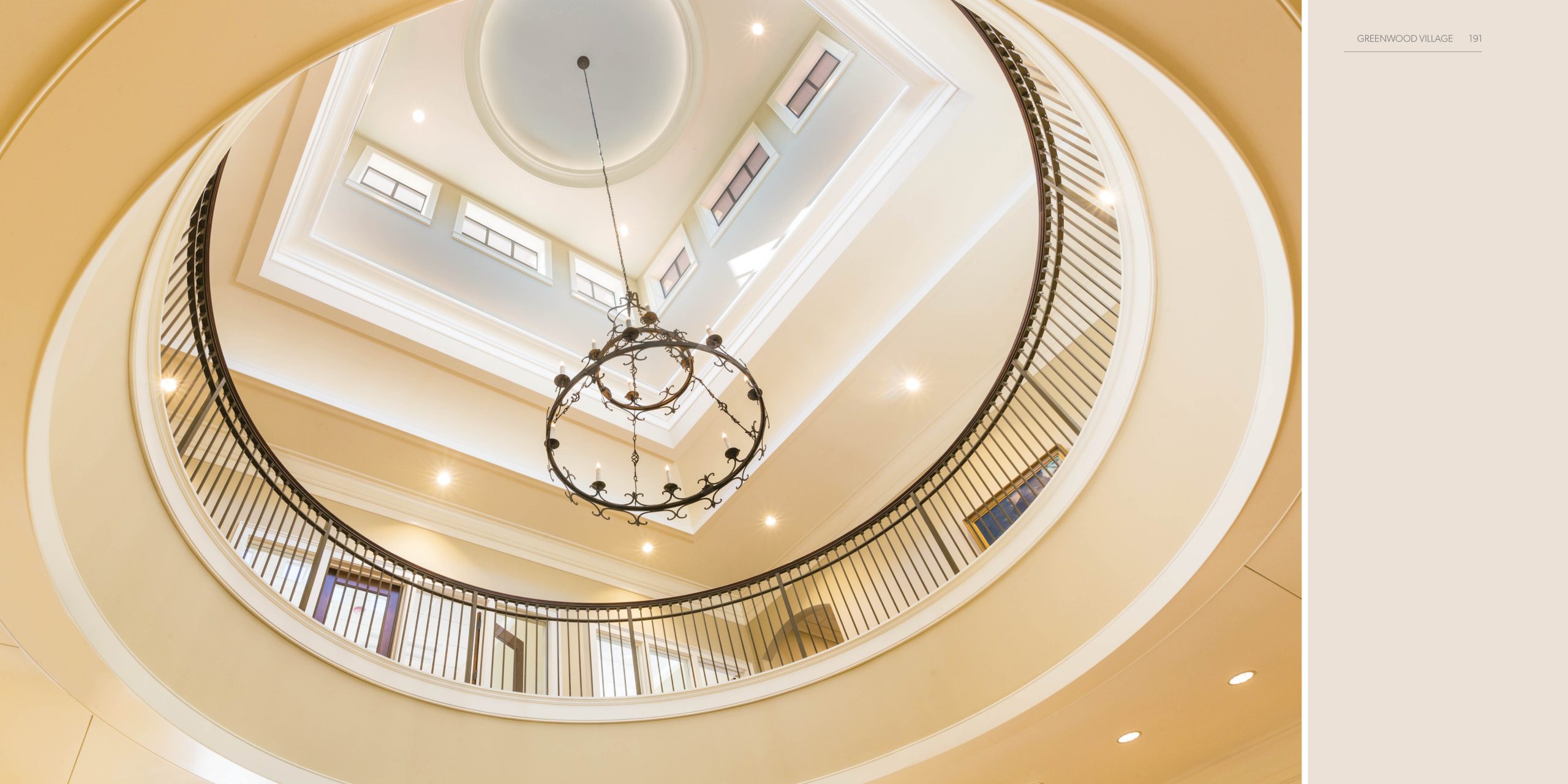
That building is round (yes, round) and features an eye-catching yellow façade and classical proportions. It most definitely makes a statement, provocative without being aggressive (IMO). It says quality and permanence, but also sophistication. I think it’s awesome.
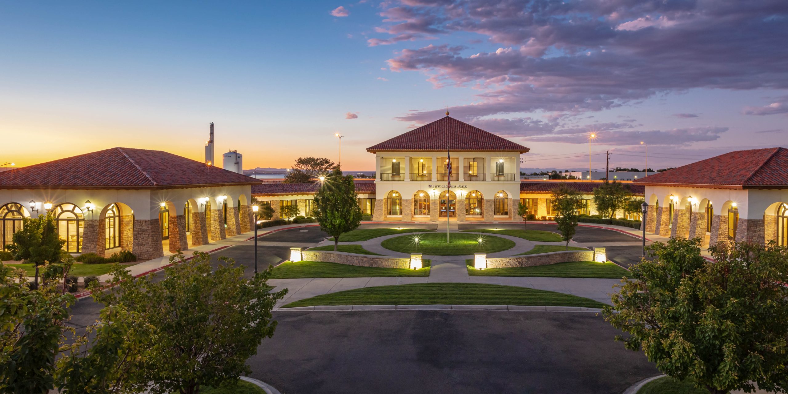
What followed over the next two decades was a series of offices hopscotching across the country. In Swansboro, North Carolina. Tallahasee, Florida. Leesburg, Virginia. Scottsdale, Arizona. Albuquerque, New Mexico. Denver, Colorado. Folsom, California. Portland, Oregon. And more.
As they set out to build those regional offices, the architect and the banker decided to do something different than most corporate architecture programs would ever do:
They wouldn’t have cookie cutter design.
Instead, the way it worked was this: The classical principles at the heart of the brand’s use of architecture would travel, defining all structures, but each office design would embrace regional aesthetics and feature regional materials.
Sounds like a lot of work. How do you figure it out? You look around a lot and you ask a lot of questions.
“What kind of stone or brick or wood did they use when they built the college campus?” “What design forms did they use when they put up the civic buildings, the train stations, the post offices, the libraries, the city hall?” “What are the architectural and ornamental cues found uniquely across the region?” Those were the questions they asked. And then found answers to. And then brought into the design and construction process.
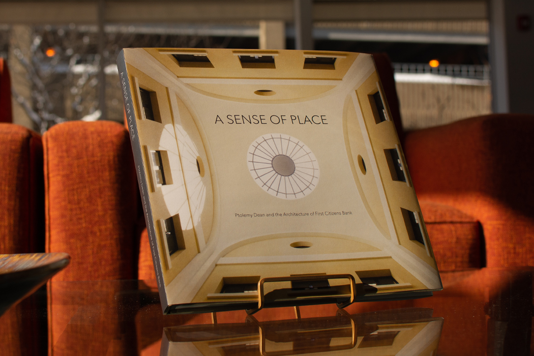
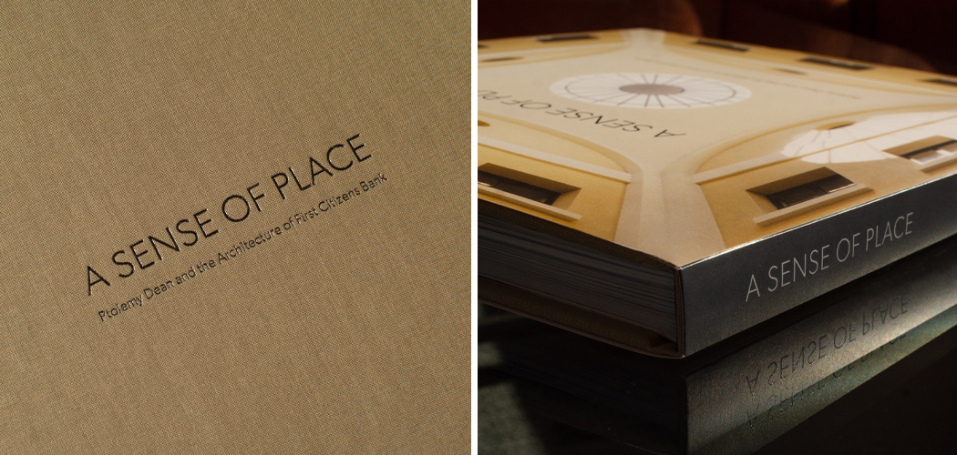
The goal being something you’d call “a sense of place,” an architectural ambience to reflect a community the bank was now serving while still creating a feeling of what it’s like to be part of the brand. First Citizens was coming into town and bringing its values with it; at the same time it was committed to establishing itself as a good citizen of that community.
So, flash forward to the spring of 2018 (if memory serves). Our client says, “Hey, we have this idea to put some kind of book together to commemorate this body of work. Would Factory be interested in doing that?”
I did not need to be asked twice.
You see, at Factory, we have this kind, “Let’s put on a show!” mentality. So whatever somebody might be expecting us to do, we almost always see something even bigger, even better, even more.
What we did (over the next year and change) is create a beautiful coffee table book about the bank, the banker, the architect and, of course, the buildings.
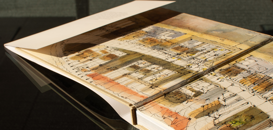
We selected an even dozen of the designs to feature. I sat down with Ptolemy Dean for a few hours and interviewed him about, well, a lot of stuff. I turned that into an informal monograph, all in his words, about the working partnership with Mr. Holding, about architecture and how people relate to it and how it creates human experiences. I also interviewed other folks integral to the process. And we worked with photographers to gather existing art and to take new photography (including a drone shot of the ambitious Albuquerque office, which cannot be adequately captured from the ground). We sourced and scanned archival materials. Ptolemy Dean shared his drawings (he’s also known for his pen work) and contributed specific thoughts about those twelve buildings.
Most of all, our design team did a lot of design.
Izabela Skonieczka (our Head of Design) and Kelsey Kaptur (who has since moved on to a less wintry climate than Michigan offers) poured a ton of talent and love into the project. One admires their enthusiasm and artistry. They designed an elegant and intelligent and immersive piece of . . . well, storytelling.
Which is what this whole meandering essay is really about (in its own storytelling way).
Brand storytelling doesn’t have to be limited to narrative advertising. It can find life in the very architecture a brand creates for its employees and customers.
Likewise in the book about that architecture . . . and the values and ideas that informed its creation.
We actually finished up this project last November – hat tip to the folks at Classic Color (which you’ll find just outside Chicago), who do amazing printing work, and to Factory’s Production Manager, Jason Barthlow, who supervises all things print for us. And we were going to share photos and thoughts about the project earlier this year. But then YOU KNOW WHAT happened and everyone’s plans went at least a little haywire. But here we are in November again and thought, hey, now’s a good time to share this labor of love.
Which is what it was: A labor of love. It was fun and challenging. And a giant mountain of hard work. But it’s also incredibly satisfying to look back on. And, as people who are fans of all the brands we work on, an honor to create.
And share.
ml